Clustering and decision tree
On the final day of my statistics training I learnt clustering and decision tree. The funny thing about these 2 topics is I learnt the algorithms in my computer science class but was never taught how to apply them to real world problems. That’s what I’m doing today.
Clustering
Clustering is good for uncovering unknown groupings in a data set. It is primarily a descriptive technique to help ask further questions in future analysis. The following table lists several countries with their numerical scores on several measures:
| Country | Literacy | Infant mortality | Birth rate | Death rate |
|---|---|---|---|---|
| Argentina | 95 | 25.6 | 20 | 9 |
| Australia | 100 | 7.3 | 15 | 8 |
| Bolivia | 78 | 75 | 34 | 9 |
| Cameroon | 54 | 77 | 41 | 12 |
| Chile | 93 | 14.6 | 23 | 6 |
| China | 78 | 52 | 21 | 7 |
| Costa Rica | 93 | 11 | 26 | 4 |
| Egypt | 48 | 76.4 | 29 | 9 |
| Ethiopia | 24 | 110 | 45 | 14 |
| Greece | 93 | 8.2 | 10 | 10 |
| Haiti | 53 | 109 | 40 | 19 |
| India | 52 | 79 | 29 | 10 |
| Indonesia | 77 | 68 | 24 | 9 |
| Italy | 97 | 7.6 | 11 | 10 |
| Kenya | 69 | 74 | 42 | 11 |
| Kuwait | 73 | 12.5 | 28 | 2 |
| Mexico | 87 | 35 | 28 | 5 |
| Nicaragua | 57 | 52.5 | 35 | 7 |
| Nigeria | 51 | 75 | 44 | 12 |
| Phillippine | 90 | 51 | 27 | 7 |
| Somalia | 24 | 126 | 46 | 13 |
| Thailand | 93 | 37 | 19 | 6 |
| USA | 97 | 8.1 | 15 | 9 |
| Vietnam | 88 | 46 | 27 | 8 |
| Zambia | 73 | 85 | 46 | 18 |
One way to group data is hierarchical clustering. The result is a dendrogram.
> countries <- read.csv("countries.csv", row.names=1)
> clusters <- hclust(dist(countries))
> plot(clusters)
> 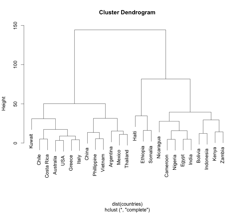
The hclust function has many clustering algorithms. Changing the algorithms sometimes produces surprising insights. A dendrogram is great for people to visualise the cluster, but if we want the clusters in numerical form we can do this:
> cut <- cutree(clusters, k=4)
> data.frame(countries, cut)
            Literacy Infant.mortality Birth.rate Death.rate cut
Argentina         95             25.6         20          9   1
Australia        100              7.3         15          8   2
Bolivia           78             75.0         34          9   3
Cameroon          54             77.0         41         12   3
Chile             93             14.6         23          6   2
China             78             52.0         21          7   1
Costa Rica        93             11.0         26          4   2
Egypt             48             76.4         29          9   3
Ethiopia          24            110.0         45         14   4
Greece            93              8.2         10         10   2
Haiti             53            109.0         40         19   4
India             52             79.0         29         10   3
Indonesia         77             68.0         24          9   3
Italy             97              7.6         11         10   2
Kenya             69             74.0         42         11   3
Kuwait            73             12.5         28          2   2
Mexico            87             35.0         28          5   1
Nicaragua         57             52.5         35          7   3
Nigeria           51             75.0         44         12   3
Phillippine       90             51.0         27          7   1
Somalia           24            126.0         46         13   4
Thailand          93             37.0         19          6   1
USA               97              8.1         15          9   2
Vietnam           88             46.0         27          8   1
Zambia            73             85.0         46         18   3
>
The k=4 argument to cutree says we want 4 clusters. It’s easily verified from the dendrogram. Alternatively, starting from the dendrogram, we can specify a height. For example, cutting the dendrogram at height 60 will yield 3 clusters (a horizontal line y=60 will cut through 3 lines).
> cut <- cutree(clusters, h=60)
> data.frame(countries, cut)
            Literacy Infant.mortality Birth.rate Death.rate cut
Argentina         95             25.6         20          9   1
Australia        100              7.3         15          8   1
Bolivia           78             75.0         34          9   2
Cameroon          54             77.0         41         12   2
Chile             93             14.6         23          6   1
China             78             52.0         21          7   1
Costa Rica        93             11.0         26          4   1
Egypt             48             76.4         29          9   2
Ethiopia          24            110.0         45         14   3
Greece            93              8.2         10         10   1
Haiti             53            109.0         40         19   3
India             52             79.0         29         10   2
Indonesia         77             68.0         24          9   2
Italy             97              7.6         11         10   1
Kenya             69             74.0         42         11   2
Kuwait            73             12.5         28          2   1
Mexico            87             35.0         28          5   1
Nicaragua         57             52.5         35          7   2
Nigeria           51             75.0         44         12   2
Phillippine       90             51.0         27          7   1
Somalia           24            126.0         46         13   3
Thailand          93             37.0         19          6   1
USA               97              8.1         15          9   1
Vietnam           88             46.0         27          8   1
Zambia            73             85.0         46         18   2
>
Next, we want to see how clusters 1 and 2 differ. Let’s trim the cluster table down a bit.
> countries <- data.frame(countries, cut)
> clusters12 <- countries[countries$cut %in% c(1,2), ]
> clusters12
            Literacy Infant.mortality Birth.rate Death.rate cut
Argentina         95             25.6         20          9   1
Australia        100              7.3         15          8   1
Bolivia           78             75.0         34          9   2
Cameroon          54             77.0         41         12   2
Chile             93             14.6         23          6   1
China             78             52.0         21          7   1
Costa Rica        93             11.0         26          4   1
Egypt             48             76.4         29          9   2
Greece            93              8.2         10         10   1
India             52             79.0         29         10   2
Indonesia         77             68.0         24          9   2
Italy             97              7.6         11         10   1
Kenya             69             74.0         42         11   2
Kuwait            73             12.5         28          2   1
Mexico            87             35.0         28          5   1
Nicaragua         57             52.5         35          7   2
Nigeria           51             75.0         44         12   2
Phillippine       90             51.0         27          7   1
Thailand          93             37.0         19          6   1
USA               97              8.1         15          9   1
Vietnam           88             46.0         27          8   1
Zambia            73             85.0         46         18   2
>
> cols <- c("red", "blue")
> col_pos <- clusters12$cut == 1
> barchart(clusters12$Literacy ~ rownames(clusters12), col=cols[col_pos+1], scales=list(x=list(rot=90)))
> 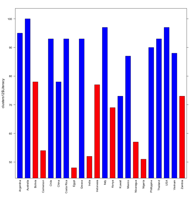
It becomes quite clear that clusters 1 and 2 differ in their literacy rates. A dot chart reveals further clustering:
> dotchart(clusters12$Literacy, labels=rownames(clusters12))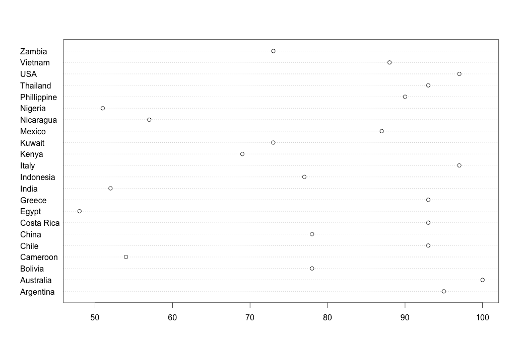
Our 2-cluster data table actually contains 3 clusters! The dot chart shows there are high literacy countries such as Australia and Italy; middling ones such as China and Indonesia; and lowly-literate ones like Egypt and India. A picture tells a thousand words indeed. The point of clustering and the different charts is really to discover hidden patterns in the data. When we start to find homogeneity as we go into a cluster (all the highly-literate countries, say), it becomes useful to explore other dimensions such as infant mortality.
Another way of clustering data is K-means clustering.
> countries <- read.csv("countries.csv", row.names = 1)
> library(cluster)
> fit <- kmeans(countries, 3)
> fit
K-means clustering with 3 clusters of sizes 10, 12, 3

Cluster means:
  Literacy Infant.mortality Birth.rate Death.rate
1 63.70000         71.39000   34.50000   10.40000
2 91.58333         21.99167   20.75000    7.00000
3 33.66667        115.00000   43.66667   15.33333

Clustering vector:
  Argentina   Australia     Bolivia    Cameroon       Chile       China  Costa Rica       Egypt    Ethiopia
          2           2           1           1           2           1           2           1           3
     Greece       Haiti       India   Indonesia       Italy       Kenya      Kuwait      Mexico   Nicaragua
          2           3           1           1           2           1           2           2           1
    Nigeria Phillippine     Somalia    Thailand         USA     Vietnam      Zambia
          1           2           3           2           2           2           1

Within cluster sum of squares by cluster:
[1] 3227.889 3992.236  784.000
 (between_SS / total_SS =  82.6 %)

Available components:

[1] "cluster"      "centers"      "totss"        "withinss"     "tot.withinss" "betweenss"    "size"
[8] "iter"         "ifault"
> clusplot(countries, fit$cluster, labels = 2)
> 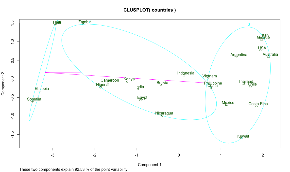
The magic here is the kmeans function that produces the specified 3 clusters we wanted. It has several algorithms to figure out a formula to describe the data columns and find the centroid of each record. The things to watch out for are cohesion of points within a cluster and separation of clusters. In our country list, Vietnam, Phillipines and China are ambiguous. Further analysis can help guide the clustering effort.
Decision tree
In this exercise we use the bank loan data sets. The first, the training set, is a historical data set of borrower data and their known default status. In other words, a group of people who’ve borrowed money and whether they defaulted the loan. We want to understand what causes borrowers to default.
> loan <- read.csv("bankloanTrain.csv")
> head(loan)
  age ed employ address income debtinc  creddebt  othdebt default
1  41  3     17      12    176     9.3 11.359392 5.008608       1
2  27  1     10       6     31    17.3  1.362202 4.000798       0
3  40  1     15      14     55     5.5  0.856075 2.168925       0
4  41  1     15      14    120     2.9  2.658720 0.821280       0
5  24  2      2       0     28    17.3  1.787436 3.056564       1
6  41  2      5       5     25    10.2  0.392700 2.157300       0
>
Most columns are easy to understand but some takes a bit of explaining. ed is an ordinal attributes with 1 meaning below high school completion to 5 representing a post graduate degree. It follows that you can use their Euclidean distance to find how different people are even though strictly speaking the difference is not linear. employ and address represent number of years spent in the current employment and home address, respectively. income, creddebt and othdebt are all dollar amount in thousands, and debtinc is debt to income percentage.
Our aim is to use the training set of 700 records to predict how likely a future borrower will default. First, we construct a decision tree.
> library(party)
> loan_ctree <- ctree(loan$default ~ loan$age + loan$ed + loan$employ + loan$address + loan$income + loan$debtinc + loan$creddebt + loan$othdebt)
> loan_ctree

	 Conditional inference tree with 10 terminal nodes

Response:  loan$default
Inputs:  loan$age, loan$ed, loan$employ, loan$address, loan$income, loan$debtinc, loan$creddebt, loan$othdebt
Number of observations:  700

1) loan$debtinc <= 14.7; criterion = 1, statistic = 106.086
  2) loan$employ <= 4; criterion = 1, statistic = 51.874
    3) loan$address <= 6; criterion = 0.992, statistic = 10.72
      4)*  weights = 114
    3) loan$address > 6
      5)*  weights = 69
  2) loan$employ > 4
    6) loan$creddebt <= 5.781564; criterion = 0.999, statistic = 15.664
      7) loan$employ <= 10; criterion = 0.993, statistic = 11.026
        8) loan$creddebt <= 2.47904; criterion = 1, statistic = 21.439
          9) loan$age <= 43; criterion = 0.974, statistic = 8.613
            10)*  weights = 158
          9) loan$age > 43
            11)*  weights = 15
        8) loan$creddebt > 2.47904
          12)*  weights = 8
      7) loan$employ > 10
        13)*  weights = 171
    6) loan$creddebt > 5.781564
      14)*  weights = 7
1) loan$debtinc > 14.7
  15) loan$employ <= 5; criterion = 0.981, statistic = 9.193
    16)*  weights = 71
  15) loan$employ > 5
    17) loan$creddebt <= 4.76476; criterion = 0.999, statistic = 14.473
      18)*  weights = 64
    17) loan$creddebt > 4.76476
      19)*  weights = 23
> plot(loan_ctree, type="simple")
>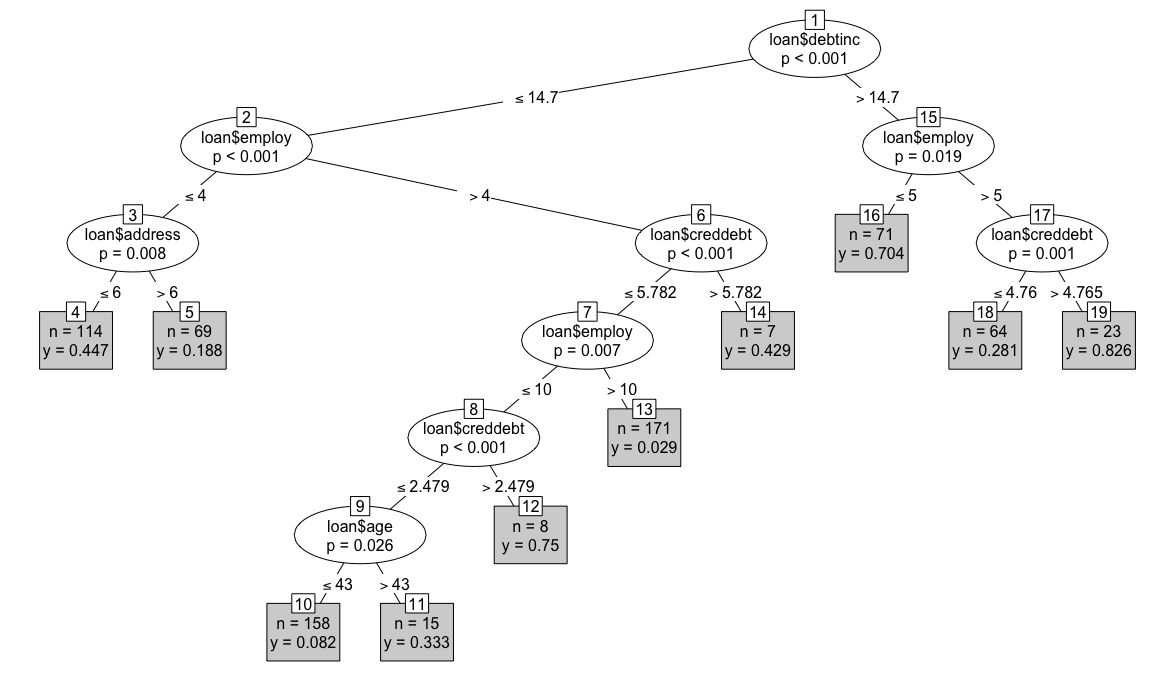
We can see that people who have defaulted most are those with a high debt-to-income ratio (> 14.7), staying at the same job for more than 5 years and has a high credit card debt (leaf node 19 on the right). Intuitively it makes sense. Although staying in a job shows stability, in this case it’s more likely that those borrowers are stuck in their job because of their high debt. Age, education and other factors don’t count as long as you have much debt. n=23 in the box means there’re 23 such borrowers in our training data set, representing 82.6% of this sub-population. It’s easy to see the least-likely to default borrowers are those with low debt, long current employment (> 10) and little credit card debt (leaf node 13). There’re 171 such borrowers in the training set and only 2.9% of them defaulted. The percentage can also be seen as the likelihood of someone fitting this profile defaulting. In other words, someone fitting the profile of a safe borrower has a 2.9% chance of defaulting.
Once we have fitted our training data to a tree, we can use the tree to predict new data. In our test data set, we have 150 loan applicants:
> test <- read.csv("bankloanTest.csv")
> head(test)
  age ed employ address income debtinc creddebt  othdebt
1  36  1     16      13     32    10.9 0.544128 2.943872
2  50  1      6      27     21    12.9 1.316574 1.392426
3  40  1      9       9     33    17.0 4.880700 0.729300
4  31  1      5       7     23     2.0 0.046000 0.414000
5  29  1      4       0     24     7.8 0.866736 1.005264
6  25  2      1       3     14     9.9 0.232848 1.153152
>
We want to see the default likelihood of each applicant. To do so, we use the predict function:
> p <- predict(loan_ctree, test)
> head(p)
        default
[1,] 0.02923977
[2,] 0.33333333
[3,] 0.82608696
[4,] 0.08227848
[5,] 0.44736842
[6,] 0.44736842
> test$default <- p
> head(test)
  age ed employ address income debtinc creddebt  othdebt    default
1  36  1     16      13     32    10.9 0.544128 2.943872 0.02923977
2  50  1      6      27     21    12.9 1.316574 1.392426 0.33333333
3  40  1      9       9     33    17.0 4.880700 0.729300 0.82608696
4  31  1      5       7     23     2.0 0.046000 0.414000 0.08227848
5  29  1      4       0     24     7.8 0.866736 1.005264 0.44736842
6  25  2      1       3     14     9.9 0.232848 1.153152 0.44736842
>
You can verify using the tree the first row in the test data set is a safe borrower. Hence, our prediction model scores this applicant with a 2.9% defaulting risk.
The trick to using a decision tree is to realise some factors are correlated. Oftentimes, a bit of domain knowledge will help spot and verify such correlations, which can be removed from the model.