Correlation visualisations
Correlation Visualisations
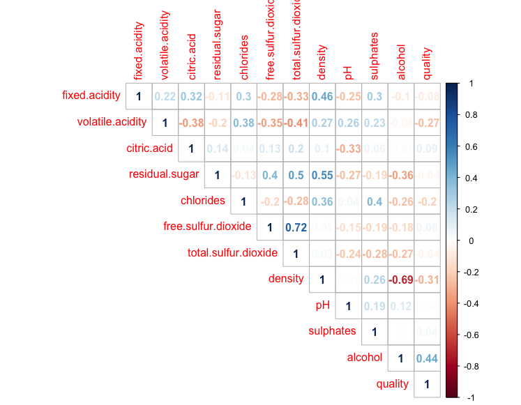
A useful way to visualise and explore features in a dataset is by looking at how different features correlate with each other. Supposed we have a dataset of wines:
> head(df)
  fixed.acidity volatile.acidity citric.acid residual.sugar chlorides free.sulfur.dioxide total.sulfur.dioxide density   pH sulphates alcohol quality type
1           7.4             0.70        0.00            1.9     0.076                  11                   34  0.9978 3.51      0.56     9.4       5  red
2           7.8             0.88        0.00            2.6     0.098                  25                   67  0.9968 3.20      0.68     9.8       5  red
3           7.8             0.76        0.04            2.3     0.092                  15                   54  0.9970 3.26      0.65     9.8       5  red
4          11.2             0.28        0.56            1.9     0.075                  17                   60  0.9980 3.16      0.58     9.8       6  red
5           7.4             0.70        0.00            1.9     0.076                  11                   34  0.9978 3.51      0.56     9.4       5  red
6           7.4             0.66        0.00            1.8     0.075                  13                   40  0.9978 3.51      0.56     9.4       5  red
>
Its correlation matrix can be obtained by:
> corrplot(cor(df[, sapply(df, is.numeric)],use="complete.obs"), method = "number", type='upper')
>